Make the search bar always visible (desktop and mobile)
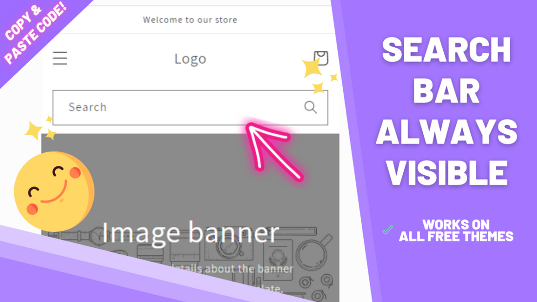
All Shopify free themes have access to a search functionality: a magnifying glass shaped search icon that when clicked opens a search bar, where you can then type whatever you're looking for and any matching results among your store's products will be shown to you . While a great tool for any store or page in the web, having to click the search icon before revealing the search bar is one click too much and a step that could simply be skipped.
Following this tutorial you'll learn not only how to make the search bar permanently visible and accessible on desktop but also on mobile regardless of the device you're using, using only copy and pasted code that will work on all free themes.
Before starting:
👉 Click here to download the code
👀 Click here to view a live demo
Step 1: Adding the code snippet to desktop
-
From your Shopify admin and navigate to Online Store > Themes > Actions > Edit Code

-
Under snippets on the left side, click on "add a new snippet". Name it exactly as shown below and hit "done":
ezfy-header-search-desktop
- Inside the file you downloaded, you'll find a file named ezfy-header-search-desktop.txt. Copy its code and paste inside this newly created file and save.
Step 2: activating the search bar on the header
-
Search for the file: header-search

-
Paste the following code at the very top of the file:
{% render 'ezfy-header-search-desktop' %}
Click on the save button.
- Amazing! Now your search bar should be visible on desktop devices. Let's add the code for it to be displayed on mobile devices as well.
Final step: making the search bar always visible on mobile
- Click here to download the code for mobile.
- Let's create a new snippet again. Click on the button "Add a new snippet", and this time name it:
ezfy-header-search-mobile
- Inside the .zip you downloaded, there's a file named ezfy-header-search-mobile.txt.
- Copy all of the code in there, paste it in the file you have just created and save.
- Now, search for the file header.liquid

-
Open it, press CTRL + F to trigger the search box, and search for:
</header
- Click on the save button and you're all set!
Conclusion
And that's it! By following the steps above, your store’s search bar will always be visible on both desktop and mobile devices, making navigation quicker and easier for your customers. This small change significantly enhances the user experience; removing unnecessary clicks increases comfort, which often translates into higher conversion rates. Every 0.1% still counts, right?
To reiterate, this method is designed to work with all free Shopify themes. However, depending on your theme version, some file names or locations might be slightly different. If you run into any issues or can’t locate a specific file, don’t worry—just reach out to us and we’ll gladly help you get everything working smoothly.
Happy selling!