Fixing broken responsive images on Shopify
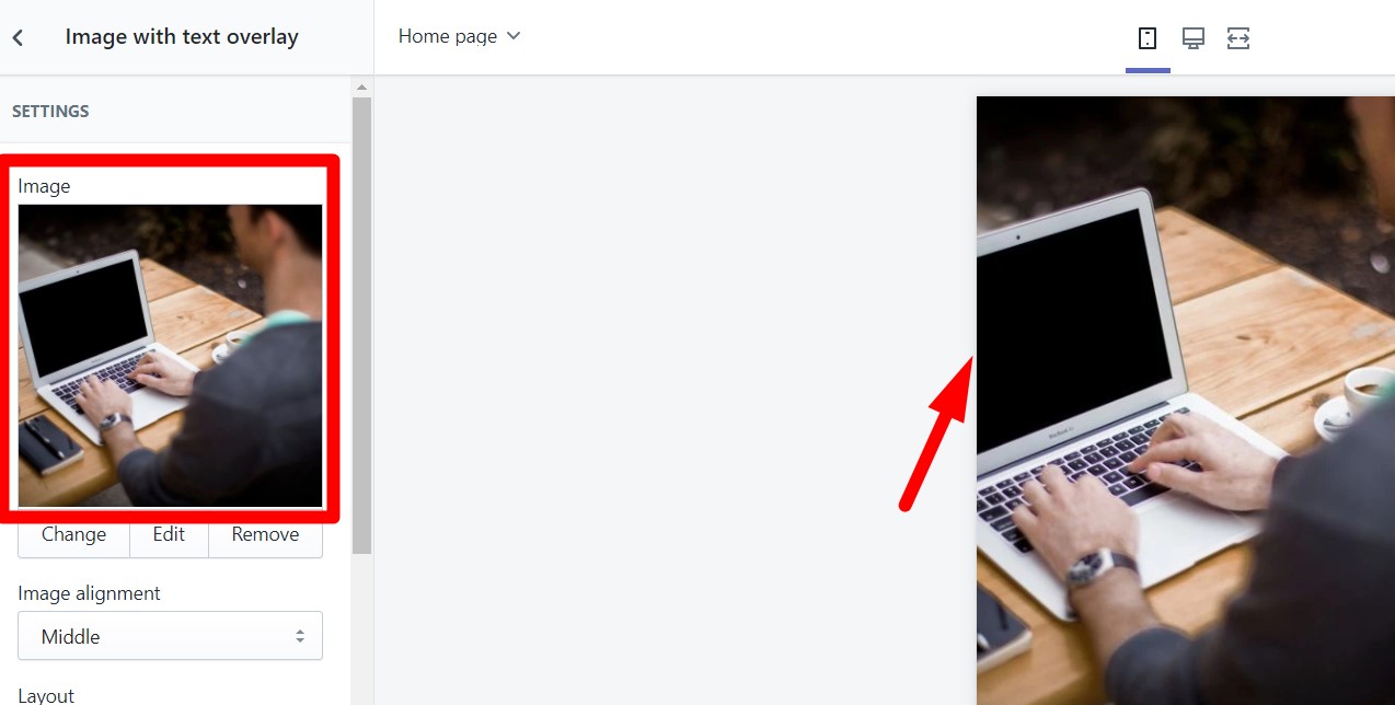
So, you just setup your theme. You add an “image with text” section or any other section that is supposed to show an image, but when you take a look on mobile the edges are being cut off.
If you are going through this right now worry not, I'll teach you a way to permanently fix this issue.
Downloading the section file
Download the files clicking here.
The installation process
- In your Shopify admin, go to Online Store > Themes > Actions > Edit Code.
- Under sections click on “Add a new section”.
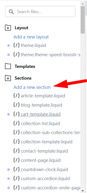
- Write the following: ezfy-responsive-banner.

- Click on the button create section.
- Inside this new file, delete everything in it.
- Copy the code that you have downloaded, either the free or pro version, paste it in and save.

Adding it to your website via the customize panel
- Click on customize theme at the top of the page.

- Find the option add section. You may need to scroll down if you have a lot of sections.
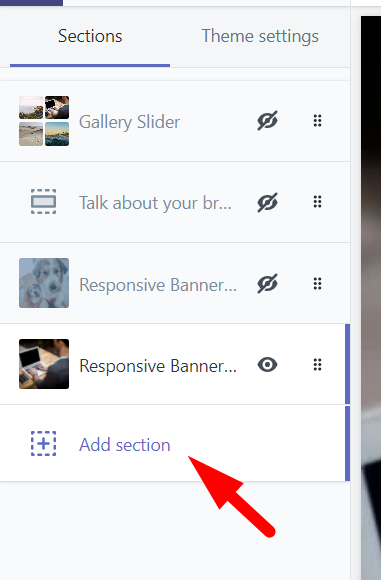
- Look for custom by EZFY. You'll now see your section there. Click on it to add it to your theme.

- Now just customize it as per your wish and click on save once you're done!
If you need any further assistance we are here for you! Reach out to ezfycode@gmail.com and we'll be happy to help.
Was this article helpful?